EXPERIAN
How Critical Thinking Drove 167% QoQ Growth From Alerts

Overview
This case study demonstrates my observation expertise and critical thinking skills, which led to exceeding our quarterly goal with 167% QoQ growth in "marketplace revenue" from the Alerts list, driven by the success of the latest upsell designs.
Business goal
Double upsell revenue from Alerts in one quarter.
Responsibility
Senior Product Designer on the Experience Architecture team.
I strategized and designed the Alerts for native apps while another designer worked on the web version.
Critical thinking moments
Why did the business team set such an ambitious goal for Alerts?
👉🏼 Alerts drive significant traffic to our products.
Old: Native (Top) / Web (Bottom)
Assumptions
Users might be skeptical about the sources of these upsells because of the illustrations.
Upsells aren't relevant to user needs.
Hypothesis
The content lacked clarity on the benefits of the service/premium membership for meeting users’ needs.
“How might we convert users into a purchasing mindset in the context of alerts?”
“Our users see Experian as trustworthy, and our products are reliable.” – UX Research.
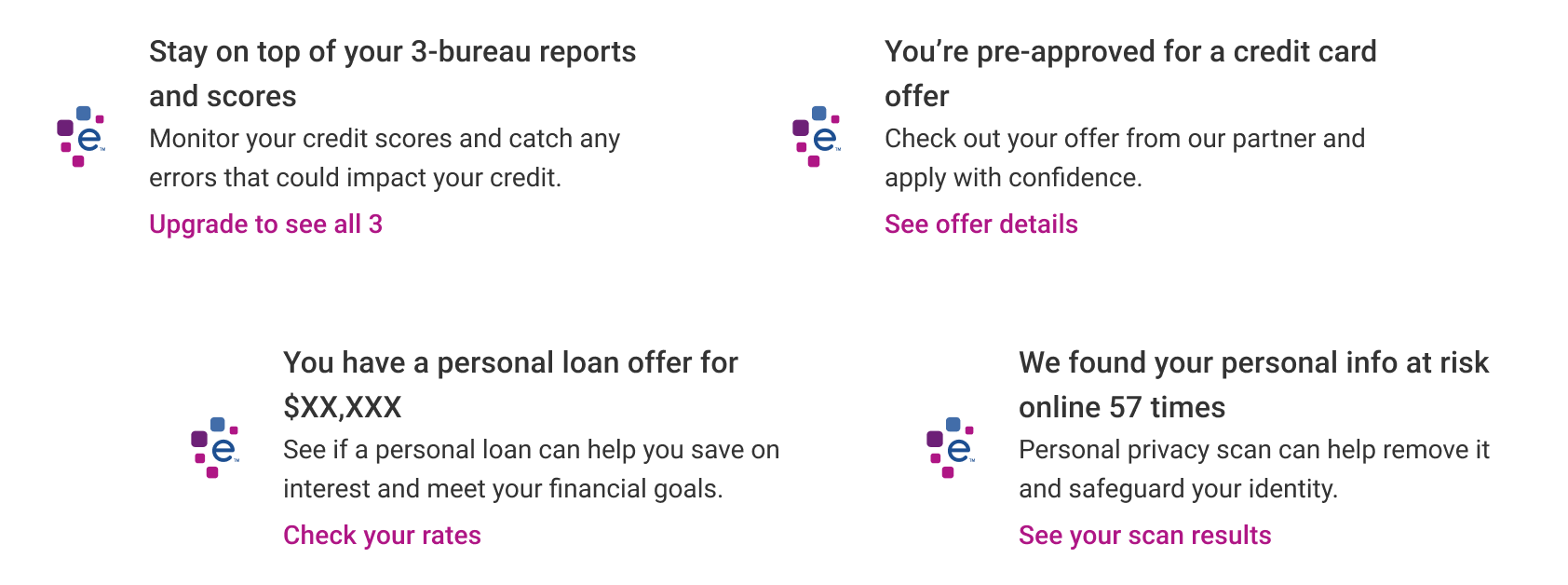
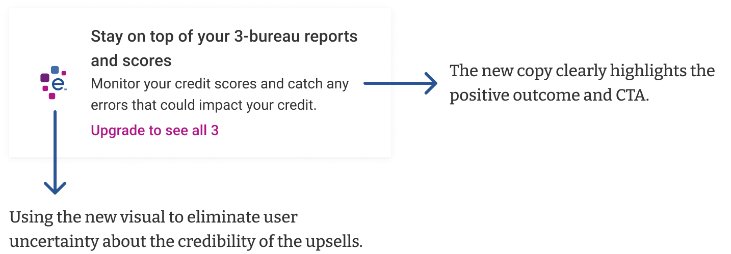
The UX Research feedback supported my suspicion that users might question the sources of these upsells. To address this, I proposed replacing the illustration and icon with the Experian logo, reinforcing credibility and trust.

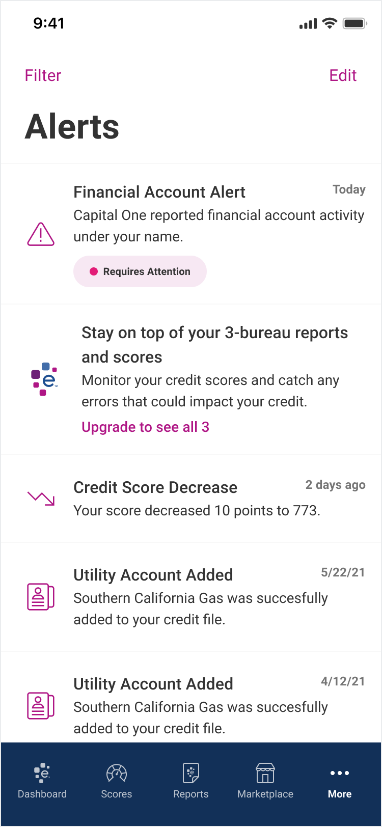
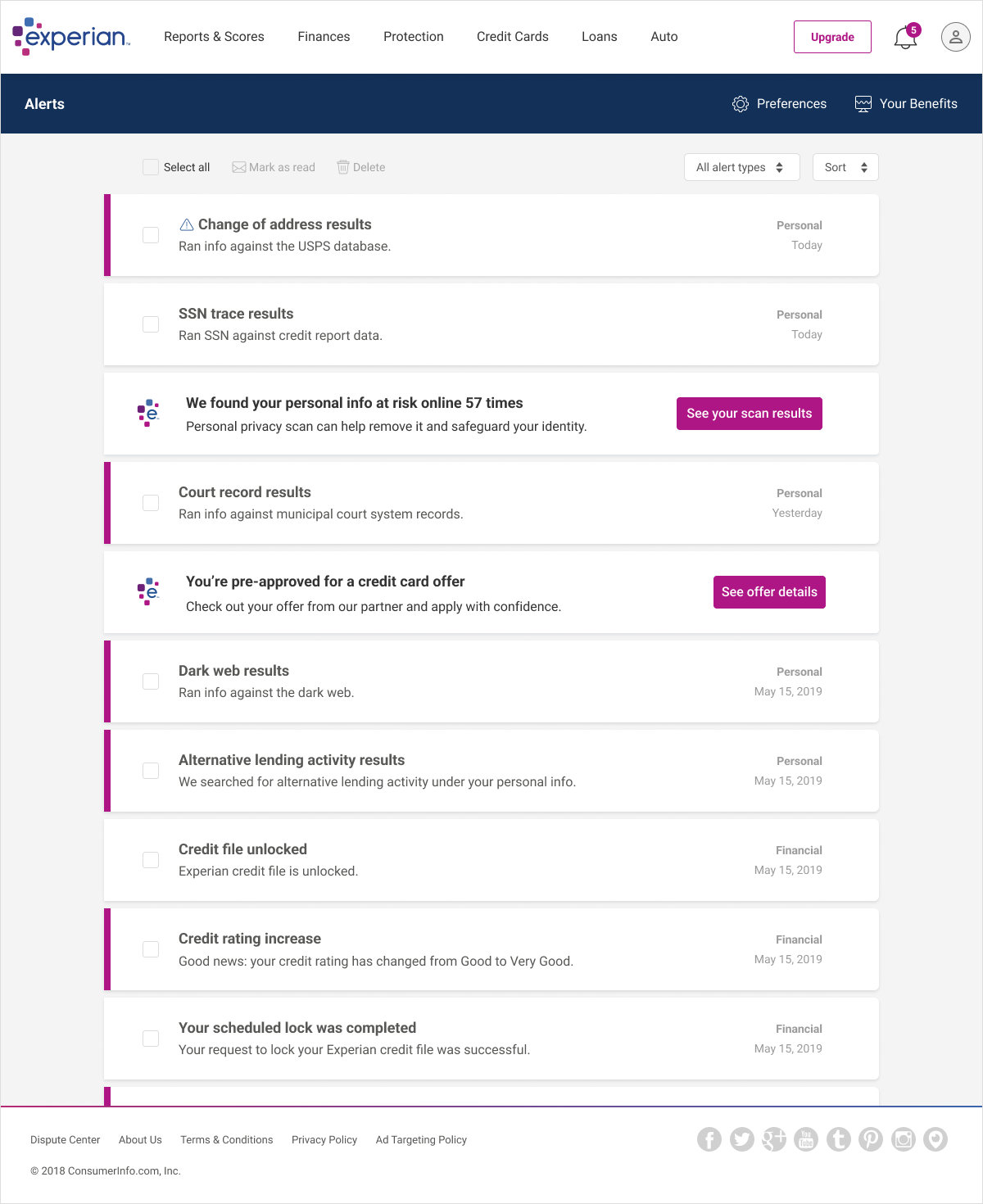
Final designs

