
LUMINARY MEDIA
Improved Design Efficiency and Visual Consistency with Component Libraries
Overview
This case study demonstrates my system thinking, planning, and strategic skills toward creating a component library for each platform, which elevates the overall visual and user experience. It also served as a solid foundation for the design team.
Challenges
Growth mindset – With no previous experience with Figma, I took this excellent opportunity to learn it and became the go-to person for questions.
Self-starter – Before I joined, the lead designer had already gone on maternity leave, leaving no one to onboard me with the design files and other essentials. So, I set up meet-and-greets to connect with key stakeholders and gather as much information as possible about the status and details of ongoing projects.
Responsibility
I was a Contract UX Designer to continue leading the redesign effort for a multi-platform product overhaul launched across iOS, Android, and desktop in 2020.
In addition, I worked closely with the development teams during design handoffs and provided design feedback before the product's launch.
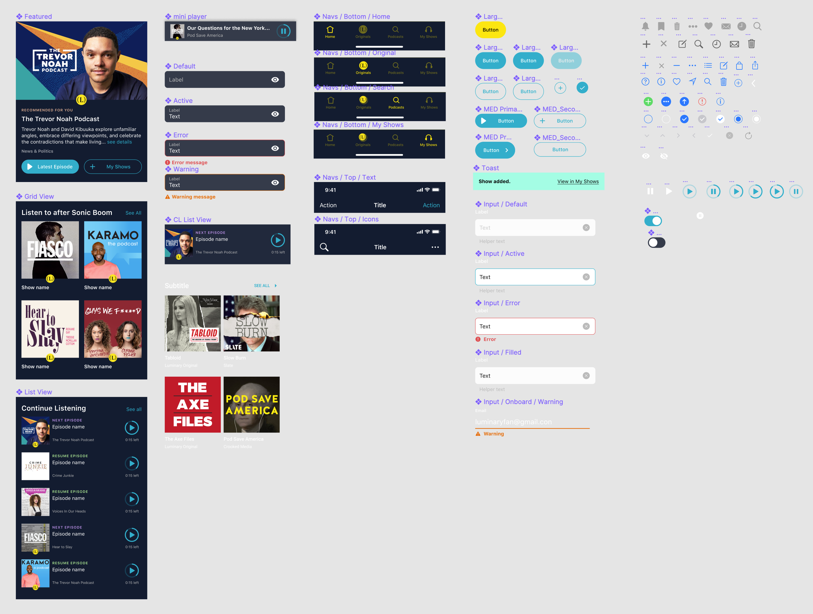
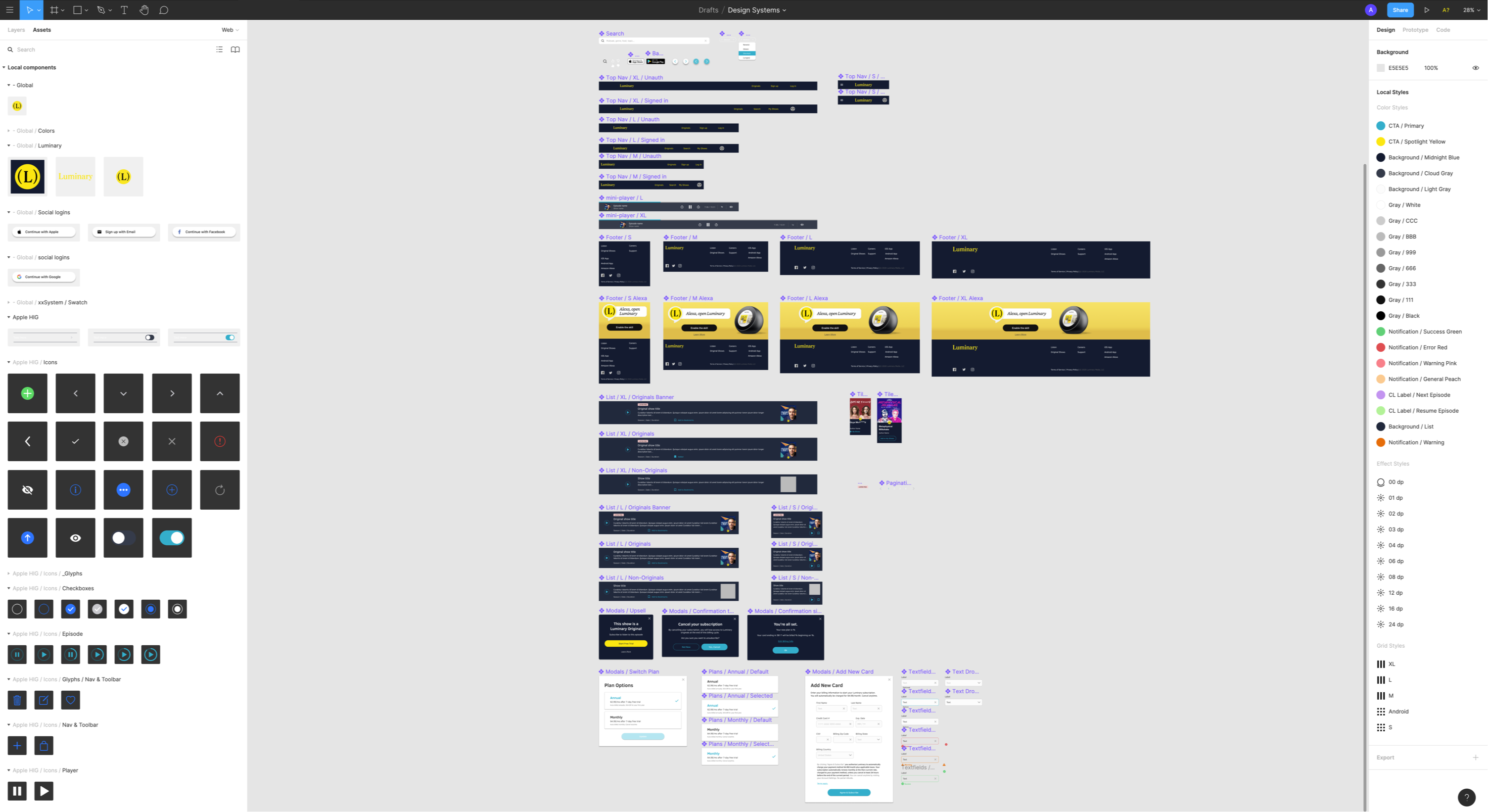
Atomic Design
With the atomic design approach, switching to different button states, icons, colors, and images became effortless once it was set up.